Learn Bootstrap with this cheat sheet I built.
Build 7 Bootstrap components with me. Pre-requisites: HTML and CSS (beginner-level)

I am a B.Sc. (hons) Computer Science graduate from Delhi University. I like making websites with responsive design, accessibility and pleasing aesthetics. When I'm not coding, I'm probably reading 😄
After gaining beginner-level experience with HTML, CSS, and JavaScript, I've decided to start learning Bootstrap. As a first step, I created a cheat sheet that contains some Bootstrap components.
In this article, I'll walk you through the process of creating these simple components!
For anyone who doesn't know what Bootstrap is and has just stumbled upon this article:
Bootstrap is an open-source HTML, CSS, and JS framework that helps Web Developers build quick, customizable, and responsive designs. It is a mobile-first framework that simplifies the tedious process of creating web development components from scratch.
You can learn more about Bootstrap at their official website.
What are we building?
- Responsive Nav Bars
- Modals
- Forms
- List Groups
- Cards
- Tables
- Alerts
Disclaimer: The bootstrap version used is v4.6. The latest version is v5.1 however this article includes basic components which hasn't changed much in the later version.
Side note/Advice: This article is quite long and if you are completely new to Front End Development I would recommend reading and trying to learn one component per day.
Visit to set up bootstrap in your environment
Responsive Nav Bars
If you are reading this article I'm assuming you are aware of a navigation bar on websites. But if I had to describe it in simple words, a navbar is an element that appears at the top of a website and it consists of a brand/company logo and some links.
To create a navbar we require an initial setup, a <nav> element (you can also use a <div> but <nav> is preferable because of HTML5 semantic rules), and add some bootstrap classes to style it.
<nav class="navbar navbar-light bg-light"></nav>
We used 3 classes: navbar, navbar-light, and bg-light (see <nav>).
- navbar: this is a bootstrap class for a navbar.
- navbar-light: gives a black color to the text in the navbar, we use this because by default links are blue.
- bg-light: adds a light grey background color to the navbar.
The next step is to set up some links for the brand logo and navigation.
<nav class="navbar navbar-light bg-light">
      <a class="navbar-brand" href="#">My Website</a>
      <ul class="navbar-nav ml-auto">
          <li class="navbar-item">
            <a href="#" class="nav-link">Blog</a>
          </li>
          <li class="navbar-item">
            <a href="#" class="nav-link">Home</a>
          </li>
          <li class="navbar-item">
            <a href="#" class="nav-link">About</a>
          </li>
          <li class="navbar-item">
            <a href="#" class="nav-link">Contact</a>
          </li>
       </ul>
</nav>
Note: For the brand logo, I'm using text but you can replace it with an image if you like.
We added 5 new classes: navbar-brand (see first <a>), navbar-nav (see <ul>), ml-auto (see <ul>), navbar-item (see <li>), and nav-link(see <a> inside <li>).
- navbar-brand: used for the brand/company logo.
- navbar-nav: this class is assigned to the container element which contains the navigation links, in this case
<ul>. - ml-auto: this class sets the margin-left property to auto for the
<ul>tag. If we don't use this class then what happens is that the brand logo and navigation are put next to each other. By using this we create a nice gap between the brand logo and navigation so the brand logo is at the left corner and navigation is at the right corner. - navbar-item: this class is assigned to style the list item which contains the nav link.
- nav-link: this class is used for the navigation link ie the
<a>tag.
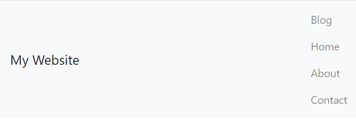
So far our navigation looks something like this:

This navbar looks quite nice on the desktop but not on mobile phones (or other devices with small screens) because it's missing a key ingredient right now, which is responsiveness. It looks like this is on a smaller screen:
If you are only interested in creating a navbar for large size screens you can skip to the next section. But the sole reason for using bootstrap is to create responsive elements without writing a lot of CSS.
What we usually expect is that on mobile phones the navigation should collapse/hide and there should be a button that can be used to toggle the navigation. So, let's do that.
Things we need to do to achieve that:
- Add a container element for the navigation list which will be the collapsible element
- Add a button that triggers the navbar collapse toggle behavior
- Add a class that will tell at what screen size the navigation should be hidden.
<nav class="navbar navbar-light bg-light navbar-expand-sm">
      <a class="navbar-brand" href="#">My Website</a>
      <div class="collapse navbar-collapse">
        <ul class="navbar-nav ml-auto">
          <li class="navbar-item">
            <a href="#" class="nav-link">Blog</a>
          </li>
          <li class="navbar-item">
            <a href="#" class="nav-link">Home</a>
          </li>
          <li class="navbar-item">
            <a href="#" class="nav-link">About</a>
          </li>
          <li class="navbar-item">
            <a href="#" class="nav-link">Contact</a>
          </li>
        </ul>
      </div>
    </nav>
We added 3 new classes: navbar-expand-sm (see <nav>), collapse, and navbar-collapse (see <div>).
- navbar-expand-sm: this class says to expand the navbar list for screens equal to or greater than 768px wide (tablets or larger devices) otherwise collapse.
- collapse: this class is added when we want to make an element a collapsible element.
- navbar-collapse: this is to be more specific than the collapsible element is a navbar.
The last thing we need is a button that will trigger the collapse action.
<button type="button" class="navbar-toggler" data-toggle="collapse" data-target="#collapsible-navbar">
        <span class="navbar-toggler-icon"></span>
</button>
We added 2 new classes: navbar-toggler (see <button>) and navbar-toggler-icon (see <span>).
- navbar-toggler: this class makes sure that this button is used to toggle the navbar collapse action.
- navbar-toggler-icon: this class provides a hamburger icon for our button.
I want to mention one thing here, make sure to add the data-toggle and data-target attributes to the button otherwise this button won't work. I'll explain their functionality: data-toggle= "collapse" toggles a collapsible element to shown or hidden and data-target is always set to the id of the element you want to toggle, which here is "#collapsible-navbar" (this id is assigned to the <div> which has classes "collapse" and "navbar-collapse").
Note: Learn more about data-* attributes here.
Final Code
 <nav class="navbar navbar-light bg-light fixed-top navbar-expand-sm">
      <a class="navbar-brand" href="#">My Website</a>
      <button
        type="button"
        class="navbar-toggler"
        data-toggle="collapse"
        data-target="#collapsible-navbar"
      >
        <span class="navbar-toggler-icon"></span>
      </button>
      <div class="collapse navbar-collapse" id="collapsible-navbar">
        <ul class="navbar-nav ml-auto">
          <li class="navbar-item">
            <a href="#" class="nav-link">Blog</a>
          </li>
          <li class="navbar-item">
            <a href="#" class="nav-link">Home</a>
          </li>
          <li class="navbar-item">
            <a href="#" class="nav-link">About</a>
          </li>
          <li class="navbar-item">
            <a href="#" class="nav-link">Contact</a>
          </li>
        </ul>
      </div>
</nav>
Here, if you look carefully you might notice a class that I didn't mention earlier that is "fixed-top" (see <nav>).
- fixed-top: this class makes the navbar fixed to the top of the website. So, if you scroll down the navbar will always be at the top.
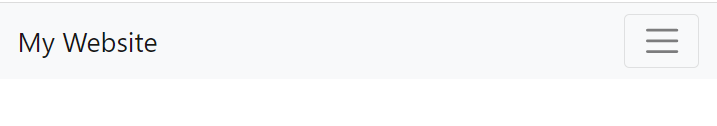
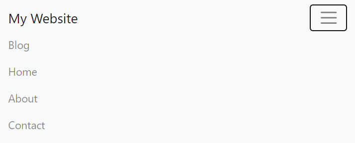
The navbar looks like this
On Larger Screens
On Smaller Screens when collapsed
On Smaller Screens when shown
Modals
A modal is a dialog box/popup window that is displayed on top of the current page. The purpose of modals can be summed up in one word: focus. If we want users to focus on a piece of content we put it in modal.
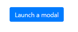
For the initial setup, we need a button that will trigger the modal.
<button class="btn btn-primary" data-toggle="modal" data-target="#my-modal"> Launch a modal
</button>
We used 2 classes: "btn" and "btn-primary".
- btn: this class styles a button or a link nicely.
- btn-primary: this class adds a blue background color to the button.
Here, data-toggle= "modal" means that the button will toggle shown or hidden action on the modal, and data-target is set to the id of the element used for the modal.
The button looks like this:-
Now, for the modal, we set up a basic structure of a modal first, i.e., a container (modal), a dialog (modal-dialog), and an element for content (modal-content).
<div class="modal fade" id="my-modal">
    <div class="modal-dialog">
        <div class="modal-content">
         </div>
     </div>
</div>
We used 4 classes: modal, modal-dialog, modal-content, and fade.
- modal: defines that this
<div>is a modal. - modal-dialog: a modal always has a dialog inside it and that's what this class is used for.
- modal-content: this class is used for the content element of the modal.
- fade: this class adds a nice effect on the modal so that it fades when displayed.
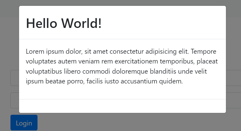
The next step is to set up the content for the modal. The content section is divided into 3 parts: header, body, and footer.
<div class="modal fade" id="my-modal">
        <div class="modal-dialog">
          <div class="modal-content">
            <div class="modal-header">
              <h2 class="modal-title">Hello World!</h2>
            </div>
            <div class="modal-body">
              <p>
                Lorem ipsum dolor, sit amet consectetur adipisicing elit.
                Tempore voluptates autem veniam rem exercitationem temporibus,
                placeat voluptatibus libero commodi doloremque blanditiis unde
                velit ipsum beatae porro, facilis iusto accusantium quidem.
              </p>
            </div>
            <div class="modal-footer">
            </div>
          </div>
        </div>
      </div>
We added new 4 classes: modal-header, modal-title, modal-body, modal-footer.
- modal-header: specifies a header for the modal.
- modal-title: specifies a title for the header.
- modal-body: specifies a body for the body.
- modal-footer: specifies a footer for the modal. (which is right now empty but we will add a button to it in the next step)
So far, the modal looks like this:-
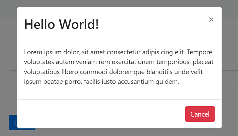
Now, we want to add a button when clicked closes the modal.
<button class="btn btn-danger" data-dismiss="modal">Cancel</button>
Here, we are using the "btn" class to style the button adequately. Another class that we are using is btn-danger, this class adds a red background to the button. Here we set data-dismiss="modal", this attributes means that when the button is clicked the modal will be dismissed (closed).
We can put this button anywhere inside the modal but the most logical place is the footer. But before I show you the final code I want to add one more thing to this modal, a close icon in the header which will also close the modal when clicked.
<button type="button" class="close" data-dismiss="modal">
<span>×</span>
</button>
close is a generic class in Bootstrap which means this is a close button. × is used for the cross icon. This step is not necessary because we already have a button to close the modal but this is how most modals or pop-up windows are styled on the web.
Final Code
<div class="modal fade" id="my-modal">
<div class="modal-dialog">
<div class="modal-content">
<div class="modal-header">
<h2 class="modal-title">Hello World!</h2>
<button type="button" class="close" data-dismiss="modal">
<span>×</span>
</button>
</div>
<div class="modal-body">
<p>
Lorem ipsum dolor, sit amet consectetur adipisicing elit.
Tempore voluptates autem veniam rem exercitationem temporibus,
placeat voluptatibus libero commodi doloremque blanditiis unde
velit ipsum beatae porro, facilis iusto accusantium quidem.
</p>
</div>
<div class="modal-footer">
<button class="btn btn-danger" data-dismiss="modal">
Cancel
</button>
</div>
</div>
</div>
</div>
The modal looks like this
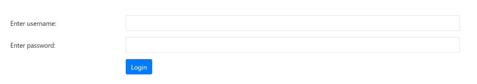
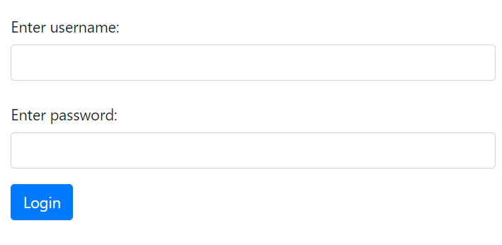
FORMS
Forms are very useful and common to be found on websites. But the default controls we have in HTML are not very aesthetically pleasing. So, we will make a simple and elegant-looking login form using Bootstrap.
The code looks like this
<form>
    <div class="form-group row">
        <label class="col-md-3 col-form-label">Enter username:</label>
        <div class="col-md-9">
            <input type="text" class="form-control" aria-label="Enter username" />
         </div>
     </div>
     <div class="form-group row">
        <label class="col-md-3 col-form-label">Enter password:</label>
        <div class="col-md-9">
           <input type="password" class="form-control" aria-label="Enter password" />
        </div>
      </div>

      <div class="row">
         <div class="col-md-9 offset-md-3">
           <button class="btn btn-primary">Login</button>
         </div>
      </div>
</form>
Before, I explain the classes we used to style the form I want to explain a little about the Bootstrap grid system. In this form, I have used classes like row, col-md-3, col-md-9, and offset-md-3; these classes are used in a bootstrap grid.
How bootstrap grid system works?
Bootstrap divides the screen into 12 columns. And we can use row and col classes to create a grid by assigning every element in this grid a width relative to these 12 columns. So, if I create two elements with class "col-8" and "col-4" respectively then it will look something like this:-
 Disclaimer: Image source - Bootstrap's Official Documentation (I do not own this image)
The left element takes the width of 8 columns and the right element takes the width of 4 columns. All elements (or columns) that should be in a row are wrapped with a parent element with class row.
If you are still unclear about this topic you can read Bootstrap's Official Documentation or you can read this article which explains it in much detail.
Now, the classes we used are: "form-group", "form-control", "col-form-label", "col-md-3", "row", "offset-md-3", "form-label".
- form-group: this class is used to group an input field and its label.
- form-control: this class is used for a form control like
<input>or<select> - col-form-label: this class aligns the text in
<label>tag with the<input>field. - col-md-3: unlike col-* class this class makes the column responsive so that on smaller size screens the columns appear one after the other and next to each other.
- row: this is used to create a row in a grid.
- offset-md-3: this class is used to create a gap in a grid row. Here, I have a row having a column of width 9 and an offset of 3 which means the column will have space on the left side of the width of 3 columns.
Apart from that, we have a primary button.
The form looks like this
On large screens
On small screens
List Groups
A list group is a flexible and powerful component for displaying content. It can be defined as an advanced version of an unordered list in HTML.
We will create two types of list groups:-
- A list group having some links.
- A simple list group using a
<ul>tag to just display some content.
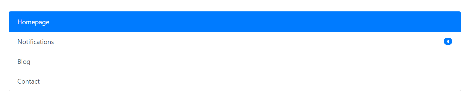
For the first list group, the code is
<div class="list-group">
        <a href="#" class="list-group-item list-group-item-action active"
          >Homepage</a
        >
        <a
          href="#"
          class="list-group-item list-group-item-action d-flex justify-content-between align-items-center"
          >Notifications
          <span class="badge badge-primary badge-pill">3</span></a
        >
        <a href="#" class="list-group-item list-group-item-action">Blog</a>
        <a href="#" class="list-group-item list-group-item-action">Contact</a>
      </div>
- list-group: this class specifies that the
<div>is used to create a list group. - list-group-item: this class specifies a group item.
- list-group-item-action: by default, the links have a blue color; to change this color to a black we use this class
- badge: this class creates a badge; badges are used to display the number of notifications or a "new" text which means something new is added in this section.
- badge-primary: this class adds a blue background color to the badge.
- bade-pill: this class makes the corners of the badge rounded so, it looks like a pill.
- active: this class makes the background color blue; it conveys a message to the user that this section is active right now.
There is an additional class that we can use for list groups, which is list-group-flush; this class removes some borders and rounded corners to render the list-group edge to edge to its parent (see cards section to know how it is used).
The first list group looks like this
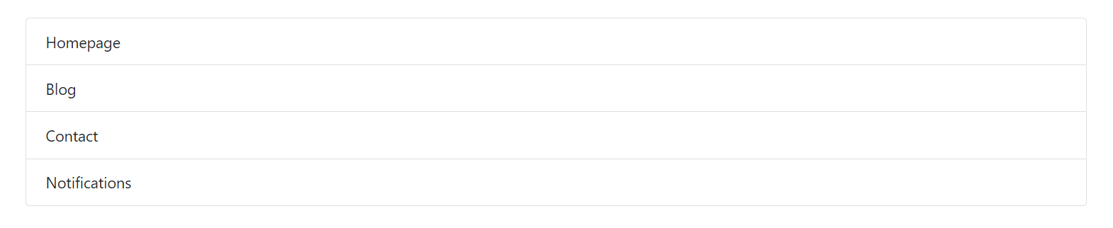
For the second list group, we use a <ul> tag.
For the second list group, the code is
<ul class="list-group">
        <li class="list-group-item">Homepage</li>
        <li class="list-group-item">Blog</li>
        <li class="list-group-item">Contact</li>
        <li class="list-group-item">Notifications</li>
</ul>
The second list group looks like this
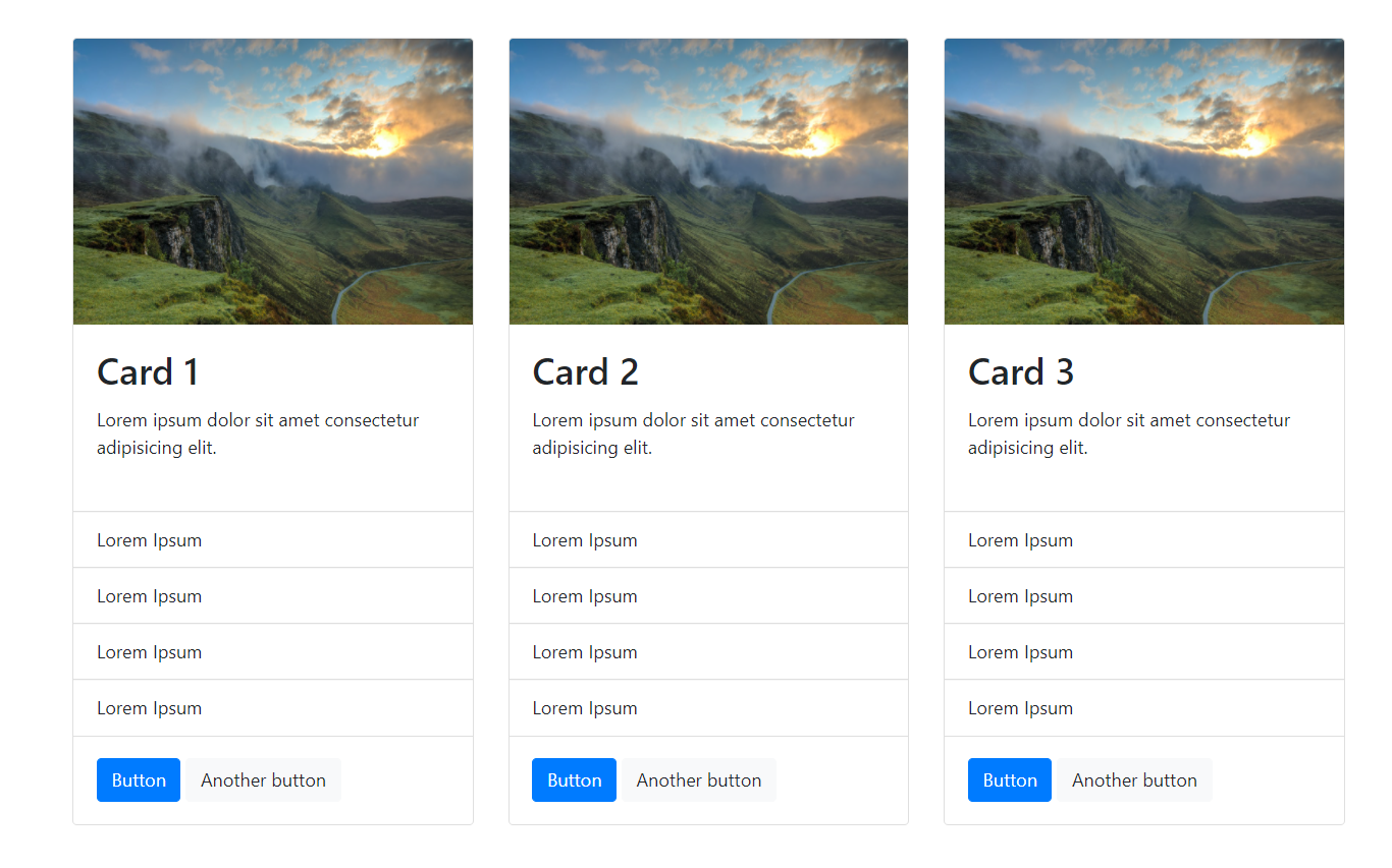
Cards
Cards are often used on websites to display different subscription plans and items on e-commerce websites. The basic structure of a card is an image, a title, some text, and a button.
The code looks like this
<div class="card">
            <img
              src="https://source.unsplash.com/1Z2niiBPg5A"
              alt="Card 1 image"
              class="card-img-top"
              height="250px"
            />
            <div class="card-body">
              <h2 class="card-title">Card 1</h2>
              <p class="card-text">
                Lorem ipsum dolor sit amet consectetur adipisicing elit.
              </p>
            </div>

            <ul class="list-group list-group-flush">
              <li class="list-group-item">Lorem Ipsum</li>
              <li class="list-group-item">Lorem Ipsum</li>
              <li class="list-group-item">Lorem Ipsum</li>
              <li class="list-group-item">Lorem Ipsum</li>
            </ul>

            <div class="card-body">
              <button type="button" class="btn btn-primary">Button</button>
              <button type="button" class="btn btn-light">
                Another button
              </button>
            </div>
          </div>
        </div>
The classes we are using are "card", "card-img-top", "card-body", "card-title", "card-text".
- card: this class specifies a card.
- card-img-top: this class styles the card image.
- card-body: this class styles the body of the class.
- card-title: this class styles the title of the card.
- card-text: this class is used to style the text for a card.
The card looks like this
I created three cards from the code above and put them in a row together and it looks like this:
Tables
For tables, there is a lot to play around with therefore, I will introduce as many classes as I can.
- table: used for a table
- table-dark: this class adds a dark background color to the entire table.
- table-striped: this class adds zebra striping to the table.
- table-bordered: adds a border around the table.
- table-hover: when you hover over the rows in the table the background color changes so you know which record you are referring to at the moment.
- thead-light: adds a light grey background to the table header.
- thead-light: adds a dark background to the table header.
- table-sm: removes some extra padding and makes the table compact.
- table-success, table-primary, table-danger, table-warning: add different background colors to the tables or individual rows depending upon where specified
The code looks like this
<table class="table table-dark table-striped table-bordered table-hover">
        <label class="mb-3">Table 1</label>
        <thead class="thead-light">
          <th>First Name</th>
          <th>Last Name</th>
          <th>Mobile</th>
          <th>Email</th>
        </thead>
        <tbody>
          <tr>
            <td>Purnima</td>
            <td>Kumar</td>
            <td>9876564590</td>
            <td>purnimak2021@gmail.com</td>
          </tr>
          <tr>
            <td>Purnima</td>
            <td>Kumar</td>
            <td>9876564590</td>
            <td>purnimak2021@gmail.com</td>
          </tr>
          <tr>
            <td>Purnima</td>
            <td>Kumar</td>
            <td>9876564590</td>
            <td>purnimak2021@gmail.com</td>
          </tr>
          <tr>
            <td>Purnima</td>
            <td>Kumar</td>
            <td>9876564590</td>
            <td>purnimak2021@gmail.com</td>
          </tr>
        </tbody>
      </table>
The table looks like this
Challenge 1
Now, I have a challenge for you. By reading this far, you have a good understanding of Bootstrap and tables are very easy to create and style therefore, I have styled two more tables that looks like:-
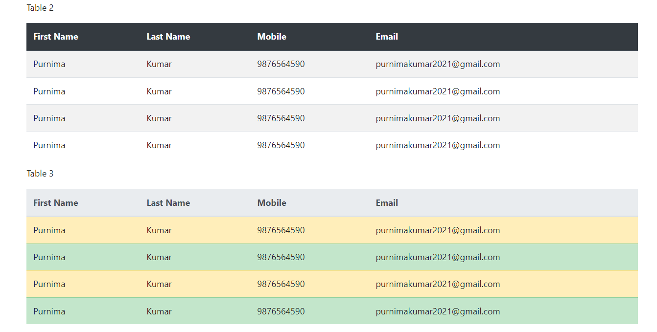
All the classes you need to create these tables are mentioned in the section above earlier. Open your editor and try to build them, then come back and finish the article.
If you get stuck, visit my cheat sheet code you can find the final code there.
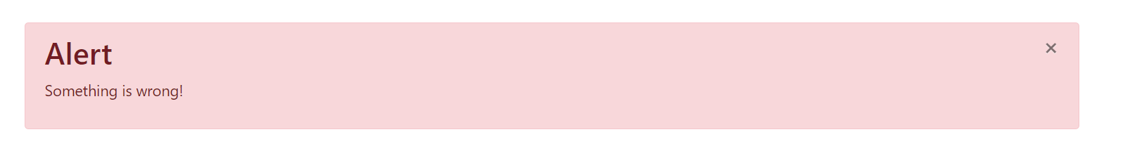
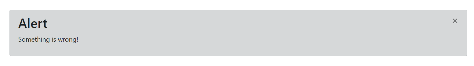
Alerts
As the name suggests alerts are used to alert the user, tell them something is wrong, or sometimes give a warning.
The code looks like this
<div class="alert alert-danger">
<button type="button" class="close" data-dismiss="alert">
×
</button>
<h2 class="alert-heading">Alert</h2>
<p class="alert-text">Something is wrong!</p>
</div>
Classes used are alert, alert-danger, alert-heading, and alert-text.
- alert: this class tells that this is an alert
- alert-danger: this class gives the alert a red background color.
- alert-heading: this class is used to style the heading of the alert.
- alert-text: this class is used to style the text of the alert.
The alert looks like this
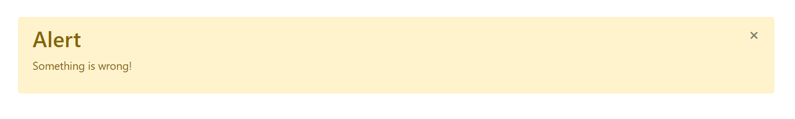
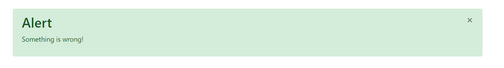
We can create different-looking alerts just by changing the alert-danger class. Bootstrap provides 9 different colors for styling the elements which are primary (provides blue color), success (provides green color), warning (provides yellow color), secondary (provides grey color), info (provides teal color), light (provides light grey color), danger (provides red color), dark (provides black color), and white (provides white color). We can use these colors using the class alert-danger class by replacing the danger with any color mentioned above (eg. alert-success).
Challenge 2
Below are some alerts with different backgrounds, open your editor and see if you can create these.
You can find the complete cheat sheet on my GitHub. You can also check out the demo for all components on GitHub pages.
Have any questions? The comment box is right below. You can also ping on my Twitter if you want.
Thank you for reading :)
